He mastered the subtle as well as the striking, juggled art-historical quotations and was sometimes also very commercial: there are already a whole series of voluminous books about the New York graphic artist, who died in 2020. But the latest work, which has just been published, puts all previous ones in the shade. Its title is simply: POP. But that’s not really what it’s about … or is it?
Review by Gerrit Terstiege


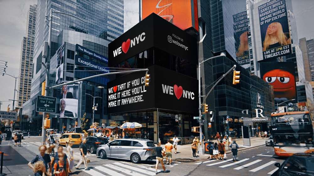
“One of the worst redesigns of all time”, “bring back the old logo” or “this is despicable”: just a few weeks ago, a New York City marketing campaign triggered a shitstorm that is rare in communication design. Graphic designers around the world were upset on social media that the city on the Hudson apparently thought it had to update Milton Glaser’s famous slogan “I❤NY” with a bold “WE❤NYC”. And indeed, the update just seems to be an effort as well as typographically and graphically unimaginative. Somehow, someone wanted to be smarter than the originator. New York art director and Glaser expert Steven Heller, for example, writes about the redesign: “Is it inviting? No! It doesn’t say ‘welcome’, it says ‘STOP’. The text is then glued discordantly to the logo’s second element, its bulbous emoji heart, which clearly refers to the more delicate symbol of Glaser’s original, which uses the heart as a cipher for love. The new version is a clumsy, sensationalist version …”
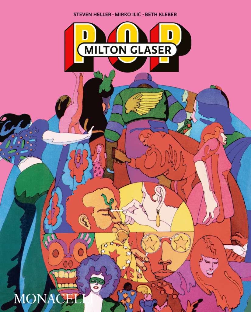
You can tell from his lines that Heller is furious about this icon desecration – after all, Glaser’s work is a real affair of the heart for him. Anyone who still has doubts about this should take the new book “Milton Glaser POP”, look and be amazed. Heller, author or co-author of well over 100 design books, has just published it together with Mirko Ilić, illustrator, branding expert and professor at the New York School of Visual Arts. The third member of the group is Beth Kleber, head of the archive of the Milton Glaser Design Study Center at SVA.
And this book has become so stunning because two wise publishing decisions have been made: on the one hand, the trio of authors limit themselves to Glaser’s strongest decades, the Sixties and the Seventies, and on the other hand, they really show a lot of wonderful, unknown things from these, so that one is completely taken aback and drawn under the spell of its wild colours and forms.
The Picasso of Graphic Design
To put it in a simple formula: In the 1960s and 1970s, Milton Glaser was the Picasso of graphic design. The label “Picasso” here not only stands for worldwide success with the public and critics. With his Dylan poster and the aforementioned rhombus with heart, he undoubtedly created graphic icons that began their triumphal march around the world in print runs of millions. But Glaser also learned something important from the Spanish painter prince – in 1978 he admitted in an interview: “My true mentor was Picasso – in a very special way. What I learned from him is: you can throw your own history overboard and just move on to remain mobile. Picasso produced quality in a variety of styles. You don’t have to stay trapped in one convention, but can take a whole range of stylistic positions that even contradict each other. That, I think, is the most important thing I learned from Picasso.”
A Huge Variety of Styles
The range of different motifs, media, themes, subjects and modes of representation that this new book illustrates is even more impressive when one realises that it is not a long creative life that is being spread out here, but rather the 20, perhaps even 25-year peak phase of a master of his craft. This actually began in 1954, when Glaser founded the legendary Push Pin Studios together with Seymour Chwast. Steven Heller, together with Martin Venezky, has already presented a similarly convincing illustrated book about this complex of works, in which Chwast and Glaser were involved. Here are some really touching doodles from the early days, for example an anthropomorphic railway from 1942 drawn in blue ink in the poetry album of a classmate.


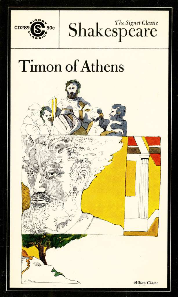
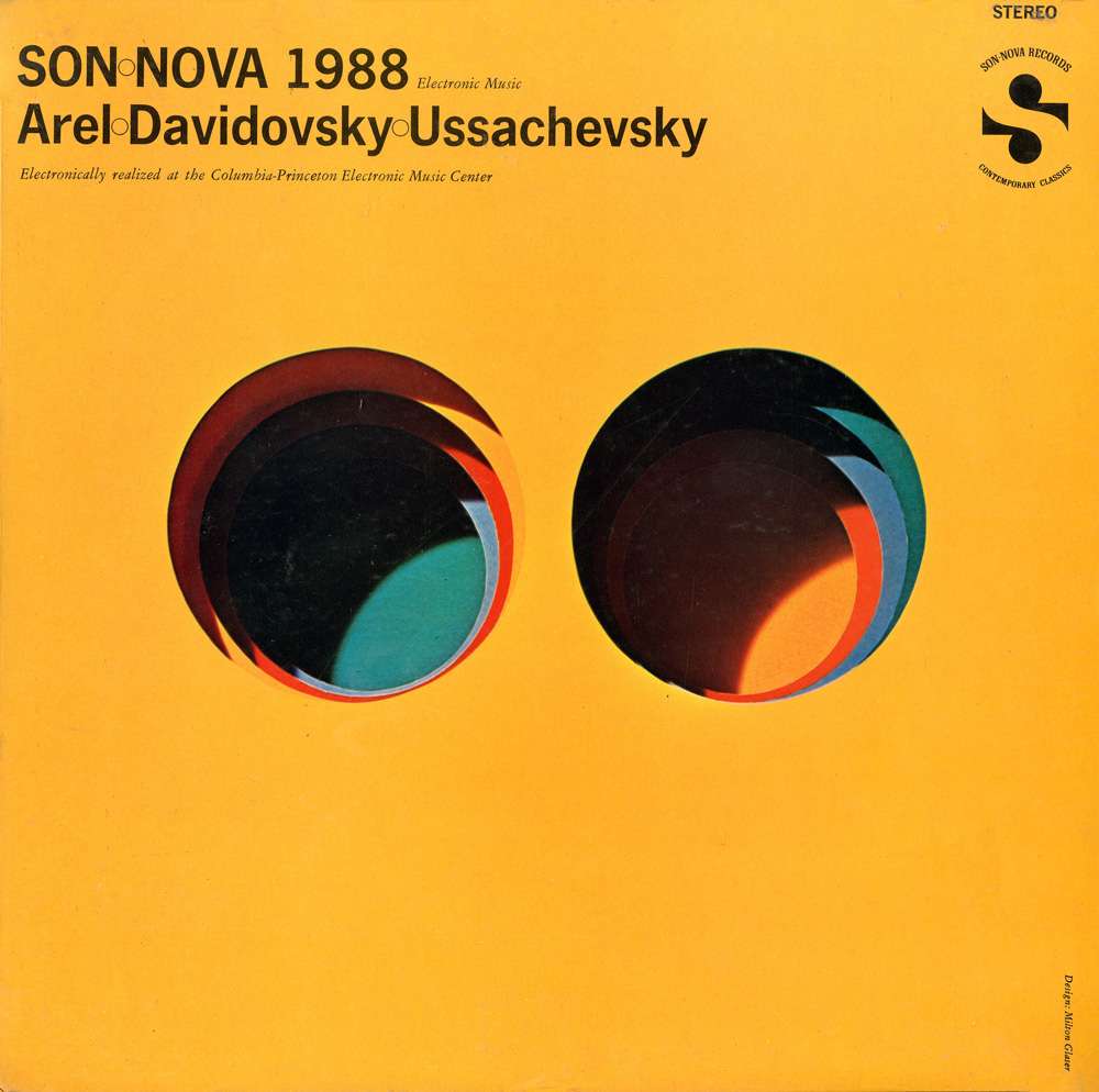
But it gets really exciting when we delve into the countless covers that Glaser illustrated in the sixties and seventies. And by this we mean mainly book titles, record and magazine covers, i.e. the cultural side of packaging design, where content and form are allowed to charmingly interplay without giving too much away. This is especially true of his decorations of literary works, from Walt Whitman to Virginia Woolf and Hermann Hesse to Tom Wolfe, where we see everything from fine line drawing with cross-hatching to delicate watercolour and collage. In the music albums for which he developed motifs, there are also gaudy, loud works, with complementary contrasts, coloured bars, lightning, rainbows and Art Deco allusions. And again and again, portraits in profile, sometimes looking to the right, sometimes to the left, as on the Dylan poster printed millions of times, which was based on a small silhouette by Marcel Duchamp. Speaking of Dylan: Here we also learn that the famous “Woodstock” festival probably took place there because of Milton Glaser: the graphic artist already had a house nearby with his wife Shirley, and drew Dylan’s manager’s attention to a building for sale in the immediate vicinity – which soon attracted the songwriter and his family to Woodstock. But the idea that Dylan could be persuaded to perform if a festival with 400,000 people was planned right on his doorstep was not at all crowned with success.


Farewell to Psychedelic Design
Incidentally, the long-haired, cheerful hippies and the cool, bald graphic designer from the Bronx never really wanted to go together. As strongly as Glaser is still associated with the psychedelic style, neatly separated by lines, he was able to part with it just as easily when times changed. Shrugging his shoulders, he said in retrospect that it was really nothing more than “painting by numbers”. He felt the same way as his German colleague and counterpart Heinz Edelmann, who set off for new shores after art directing “Yellow Submarine”. Which also ended the confusion between the two graphic artists, who held each other in high esteem, forever. But in this book you don’t really notice any stylistic change from the sixties to the seventies, because the decades are wildly intermingled. The trio of editors wisely sets other emphases, does not proceed chronologically, but groups the chapters according to “Silhouettes and Shadows”, “Frames and Geometries” or “Typefaces and Symbols”, for example.
One might now ask: What does all this have to do with our times? What can we learn from a 60-year-old drawing? What do we still care about posters, paperback covers and magazine titles with mostly deceased stars, with themes that have long since grown cold. Well, these are exactly the questions that are immediately answered when you open this book, start turning the pages and reading, and get caught up in Glaser’s visual power, precision and subtlety. And anyway, what do we care about the rock drawings of Lascaux and Chauvet? Those who don’t care about history, who don’t care about culture, art, design and poetry, people and music, will not be enthusiastic about this book either. For everyone else, a sensational panopticon awaits, a feast for the eyes, an enchantment.
Milton Glaser: POP
Steven Heller, Mirko Ilić, Beth Kleber
Hardcover, 30,5 × 26,7 cm
288 pages, 1.100 illustrations
English
Phaidon / Monacelli
47.99 Euros
More on ndion
More reviews and other articles on the subject of brands and design.
Diese Seite auf Social Media teilen:


