London’s National Portrait Gallery (NPG) is undergoing a renovation project. The project, which is being managed by Jamie Fobert Architects, entails a comprehensive re-presentation of the collection together with a significant building rehabilitation, the development of public spaces, and the establishment of a new education center. The gallery at St. Martin’s Place was closed to the public in the spring of 2020 in order to allow the construction project. Since then, the UK’s museums, communities, and schools have all participated in the massive collaborative program known as “Inspiring People”. To showcase the collection, hundreds of portraits from the NPG have traveled around the world. On June 22, the National Portrait Gallery is expected to reopen.
A new brand strategy and visual identity were created in partnership with the designers at Edit Brand Studio and the brand strategists at Boardroom Consulting in order to increase reach and relevance after the reopening. Both are intended to more emphatically demonstrate the museum’s function as a “gallery of people for people”; after all, the house employs art to bring history to life and narrate the story of Britain via portraits. The NPG was popular and had a high level of visitor satisfaction before to the gallery’s closing, but it could have done more to make its collection more accessible to the general public. A dynamic brand that would stand for both the majestic landmark building and the historic works as well as the contemporary collection and the dynamic schedule of events and exhibitions had to be created in order to strike this balance between timelessness and relevance.
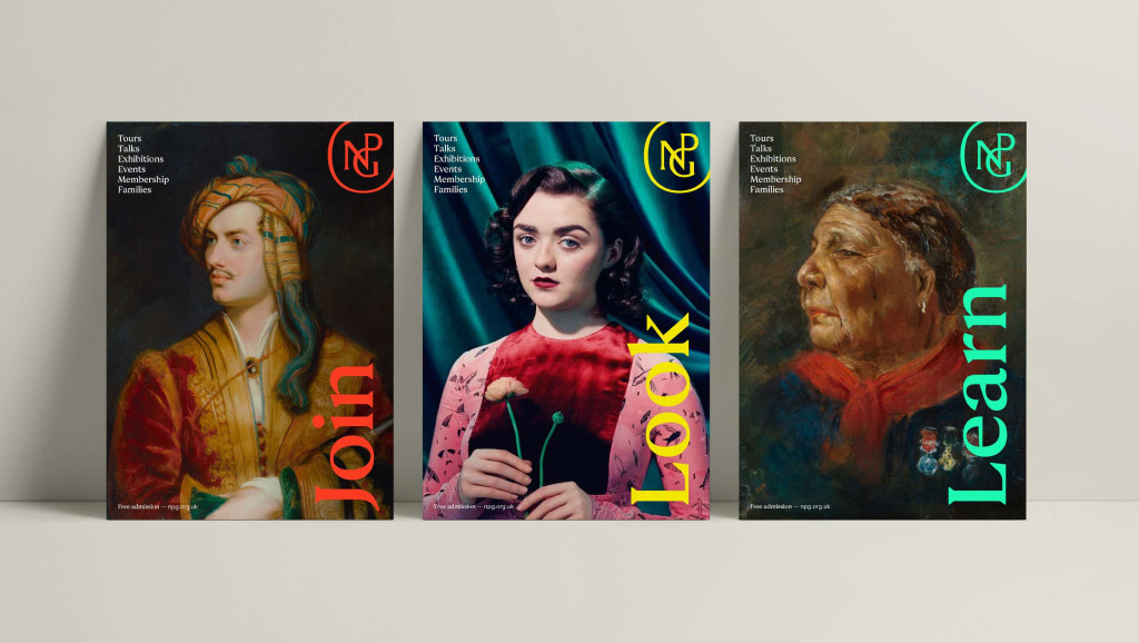
A new monogram, typeface, and color scheme were developed using references to elements from the collection; they were all influenced by historical allusions and the large collection of portraits in the gallery. The initials “NPG” may be found everywhere over the structure, including on the original mosaics, furnishings, and railings. The illustrator and typographer Peter Horridge changed an original 1893 sketch by the gallery’s founding director, Sir George Scharf, into a new emblem for the institution. A unique logo and a new typeface have also been added (the NPG Serif, developed by Monotype and based on historical typeface references). In order to create a unique aesthetic, these components are blended with a vibrant color scheme (which was in turn influenced by the colors and materials of the building and archive) and themes from the gallery’s extensive picture collection. The new brand also included the launch of a redesigned website.
More on ndion
More articles on design.
Share this page on social media:

