The 33rd Olympic and Paralympic Summer Games‘ image emphasises republican principles, historical relevance, and creative elegance. Also, the pictograms for the individual sports follow their own paths.
By Thomas Wagner
The first Olympic competition is in the visual field. A mega-event, such as the Olympics, must be globally visible as a brand on all possible media channels, but most importantly, instantly recognisable. A logo, mascot, and a distinct “look” should alert everyone who watches or participates to what is coming and accompany them throughout the Games. Identification of competition venues, athlete villages, and several other locations is necessary. According to officials, the recently announced visual identity for the 2024 Games offers the event a festive atmosphere and captures the essence of the Games in Paris. A “bold new aesthetic” combined with “the rich symbolism of the cobbled streets seen in France’s metropolitan settings” creates a look that “combines French elegance with vivid colours.” (The mascot and logo were already released in autumn 2019).

An Olympic Republican Logo
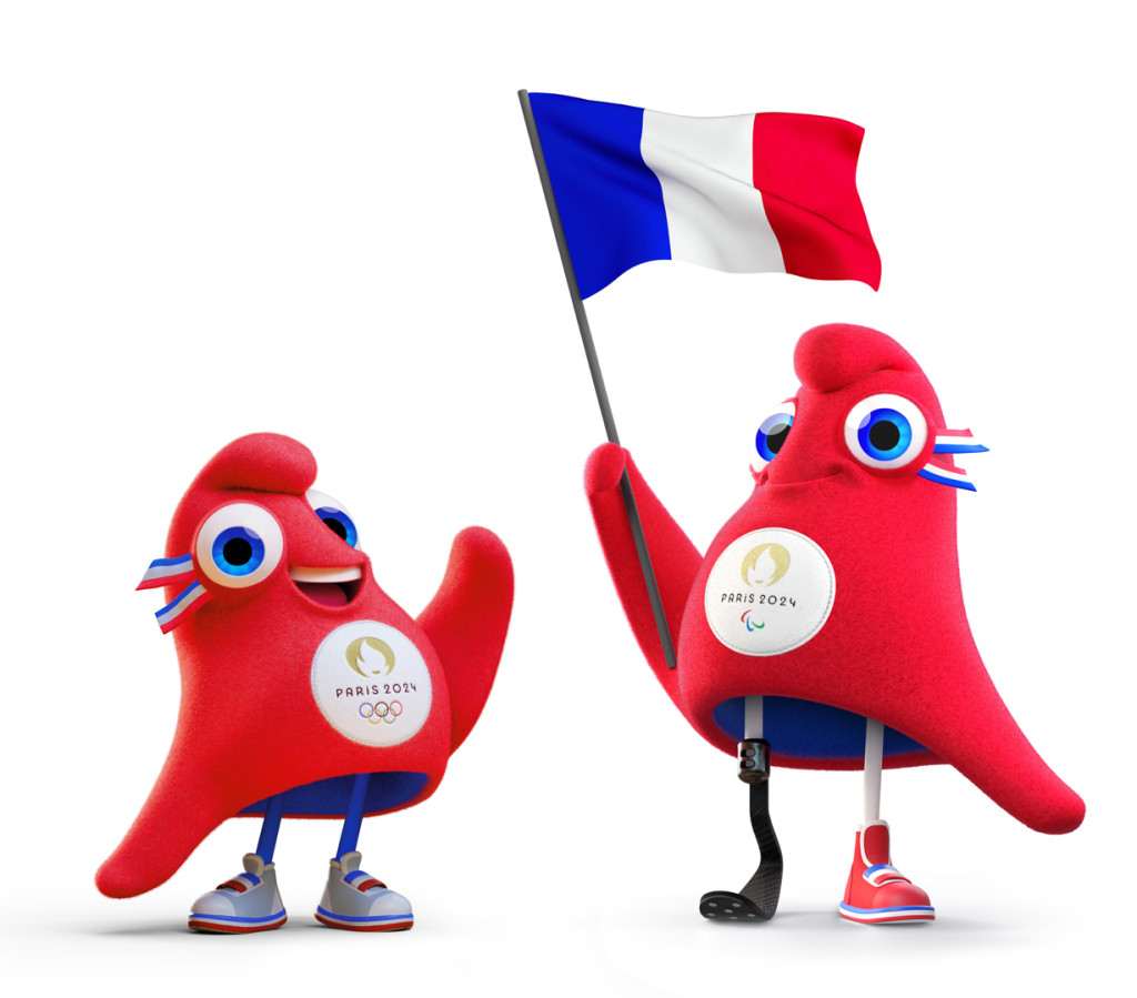
Three symbolic elements – a medal, the Olympic flame, and a “Marianne” – which represents freedom and the republic – are combined in the Paris 2024 logo. Together, they form “the face” of the games, “Games Wide Open,” which has written on its face that everyone should be free to participate, especially women. The goal was to achieve gender equality at the first Olympic Games in history, as well as to throw a bone to the first generation of female athletes who competed in the 1900 Paris Games, the first time women were allowed to compete. Another innovation: It was chosen to have a common look for the Olympic and Paralympic Games, with only minor modifications between the two, in order to promote inclusivity while also lowering expenses and environmental impact. (Some Olympic pictograms are also replaced by Paralympic ones).
Throughout the history of the Olympics, animals that were (more or less stylized) representations of the host nation were frequently used. In contrast, Paris. Here, the Phrygian hat mascots represent a republican ideal by making reference to a historically significant, well-known French emblem of freedom. The Phrygian cap was a symbol of political dedication and “liberty” worn by the Jacobins during the French Revolution. Marianne, a French symbolic figure, is frequently seen wearing a Jacobin hat. The two (adorable-looking) Phrygian caps that serve as the mascots, known as the Phryges, appear to be encouraging the sport’s revolution. With different feet, the endearing red cap can serve as an Olympic or Paralympic mascot depending on the occasion.
On and under the Pavement
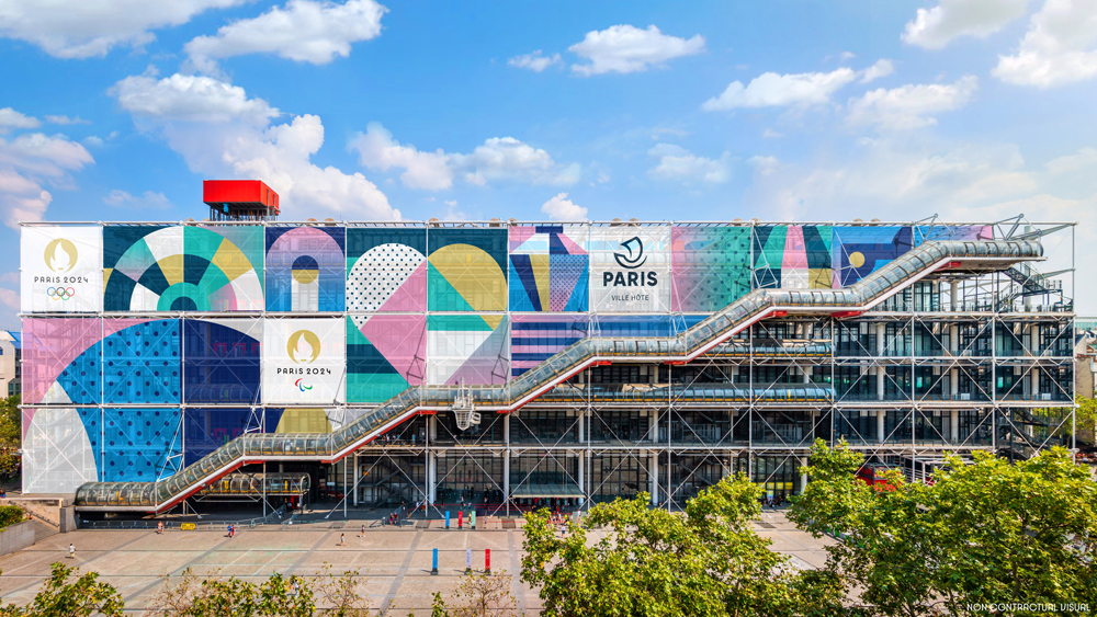
The “famous cobbled streets of Paris” have now joined the logo and mascot as an organising principle and visual grid. They serve as the “centre of the 2024 Olympic Games’ visual design.” (I wonder if they also had Paris May 1968 in mind, when the stand was buried beneath the pavement and the stones flew.) In any case, the “paving stones” can be graphically “assembled and adapted as desired” to “represent the tangible and intangible heritage of France.” In order to achieve this, they have been given three distinct types of symbols: pictures of sport, images of famous locations, or tributes to the French way of life. The “cobblestone” squares, half and full circles, triangles, and stripes create a variegated pattern that is further brought to life by various colours. Julie Matikhine, Chief Brand Officer of Paris 2024, stated that as the Games are for the entire country of France, cobblestones will be present on all of the country’s roadways. “Whether you’re at the venue or out having fun while wearing the colours of the Paris 2024 Olympic Games, the cobblestones are always with you.” The new appearance “comes to life in bright colours,” they claim (but it is unknown who developed it). Nothing less than “the abundance and diversity of France” should be represented by the colours blue, red, green, and purple that have been softened to a pastel color.
Pictograms as a Badge of Honour
At the Tokyo Olympics in 1964, pictograms for individual sports were first made available. The signs that Otl Aicher created for the Munich Olympics in 1972 are unquestionably the most well-known in our nation. By using visual symbols to transmit information, pictograms depend not only on the era in which they were produced but also on the media in which they were distributed. This is especially evident when contrasted with the twisted and interlaced pictograms of the Beijing 2008 Games, which have a faint resemblance to Chinese characters, and Aicher’s dramatically straight pictorial signs.
With a French Touch
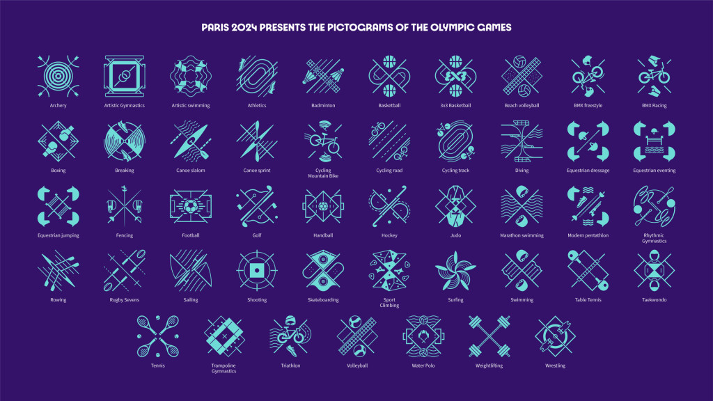
A cultural tradition is also evoked by each of the 62 sports pictograms created for the Paris Games. To represent the players’ ties to the sports they compete in, they were created as “badges of honour.” Each pictogram has a square basis and consists of three graphic components: an axis of symmetry, a representation of the of the field or environment, and a sport-specific attribute. They pay homage to the spirit of the times in their own special way in order to be original. The Paris 2024 organising committee’s president, Toni Estangu, does not casually refer to pictograms as having a “French touch.”
Pictograms do in fact reveal a unique visual language. It is unique to consider a pictograph to be a “badge of honour” in the shape of a coat of arms or shield. Because the decorative purpose outweighs the descriptive function in the implementation (owing to the symmetrical structure and the crossing diagonals), art and sport are brought closer together, but understanding is made more challenging. It can be difficult to distinguish between various fields. The pictograms are supplied in a range of media formats, including animation and moving visuals in addition to standard black and white, monochromatic, and multi-colored representations.
Esprit instead of Functionality
Giving the entire visual aspect of the Games in Paris a touch of French esprit is pretty impressive. The notion of constructing a culturally saturated image as opposed to a factually neutral one demonstrates the self-assurance of French culture, which proudly expresses itself rather than visibly acclimating to a worldwide standard language. Focusing on identity and belonging while enhancing the sense of community also matches the times. Another reason the graphics rely on playful details and vibrant colours rather than sober functionality is due to this. The font is the most obvious example of how openness and joy, history and elegance, can be mixed in a contemporary way. The specially created corporate font “Paris 2024” captures the essence of Art Nouveau and Art Deco while modernising some of their formal language. The courage for the future is frequently found in the strength of the past.
More on ndion
Discover more articles on the topics Design and Brands.
Share this page on social media:

