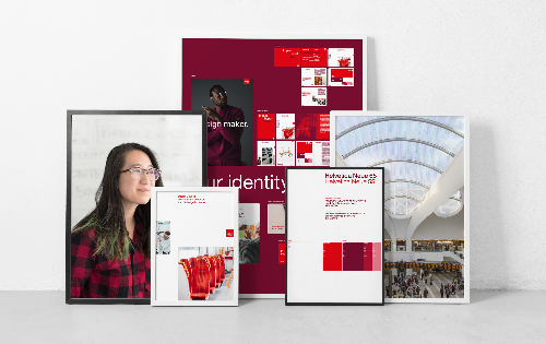
A new version of The Design Council’s visual identity has been revealed. The Design Council is the UK’s national strategic advisor on design. With the relaunch, which focuses on sustainability and accessibility, the Council also wants to initiate a discussion about the principles of graphic design and how it can “become more inclusive and responsive to the climate emergency to better serve “design’s two most important stakeholders: people and the planet”. The Council collaborated with brand agency OPX to create an updated graphic language and a simplified design system. The new corporate design emphasizes white space and makes use of the color red as a distinctive characteristic. The colour palette has been streamlined with black being substituted by a Bordeaux red that is meant to radiate depth and warmth. Tayburn McIlroy Coates designed the logo in 1996, and it remains unchanged since. With “its red base colour and Quay Sans font”, it highlights “the clarity and consistency of the brand identity”.
The Government Digital Service’s Design Lead, Mia Allers, has examined the new guidelines and offered suggestions for how they can be implemented in both the analog and digital realms. “Everything,” Allers adds, “is about clarity, usability, and impact, which are the foundations of good design.” The suggestions resulted in some changes to the new brand guidelines:
- Because white is the most energy-emitting color, an off-white color was introduced for digital applications.
- The file size of images should be reduced.
- Because serif fonts are more difficult to read for neurodiverse people, the Helvetica Neue font was selected as the signature font. More white space should also enhance legibility and enable for direct printing on white paper.
- PDFs should be used in HTML versions to guarantee readability on screens, and red and colour combinations for fonts smaller than a certain size should be avoided.
- In presentations and reports, standardized titles are used to aid in user navigation.
Minnie Moll, CEO of the Design Council, said, “When designing for the Design Council, it can be tempting to be too clever or too flashy, but OPX Studio did precisely what we needed. Instead of a rebrand, a refresh was requested, and the canvas for our communications feels fresher, warmer, and cleaner as a result of the minor but significant changes made. The fact that a sustainability and accessibility audit was carried out, Moll added, makes the brand of the “fit for a new era of design for planet”. “This project is the result of an accident,” said David Bennett, Creative Director of OPX Studio. A meeting with Minnie Moll in 2021, where she spoke strongly about the Council, he said, “got OPX thinking about what design means to everyone” and led to “a simplified visual language” that “will hopefully help support the Council’s brilliant work”.
More on ndion
Discover more articles on the topic of design and brands.
Share this page on social media:

