There are already numerous books on the British architect Norman Foster. But now, in a two-volume publication, the great designer provides personal insights into his creative process for the first time and reveals what inspired him to create his buildings. Without a doubt: this is also worth reading for designers.
Review by Gerrit Terstiege

The major Foster retrospective at the Centre Pompidou has just ended – a fitting venue, after all, one of the architects of the Paris museum, Richard Rogers, was one of Foster’s early companions. Both had studied at Yale and established the architecture studio “Team 4” in 1963 together with their partners, the sisters Wendy and Georgie Cheesman. The architectural principle of the Centre Pompidou is to turn the inside inside out: We find pipes, conduits, escalators as elements of the façade. The building’s metabolism is staged without regard to tradition; the postmodern museum building first exhibits itself. And in a certain way, Baron Foster also turns his inner self inside out with his two large-format books, for readers can expect a thoroughly personal retrospective, rich in memories, classifications and insights. But why does this require two volumes that together weigh more than 11 kilos? Well, a large oeuvre naturally demands just as much documentation – and we already know numerous works from Taschen Verlag that go beyond all dimensions. A huge book on Muhammad Ali (“GOAT”), for example, could only be bound at the Vatican, where they have experience with large and large-format works. However, the two Foster volumes are very fundamentally different from each other – and that is what makes them so special.
The first illustrated book, almost 700 pages in light grey, is already an impressive overview of Foster’s architectural projects all over the world, from his beginnings to the present, and even into the near future – because the last pages show several ongoing projects. The list of his greatest hits alone is impressive: Apple Park, Reichstag conversion, Wembley Stadium, Commerzbank headquarters in Frankfurt, several airports, museums, bridges – only last year on holiday in France, Foster’s Millau Viaduct almost cost me my life, because of course I had to pull out my mobile phone and look for the video function while driving. Then there are many things to discover that are less well known: designs for villas, yachts, aeroplanes. But also tables, chairs, sofas, lights and door handles. Over the decades, Foster + Partners has also produced numerous design concepts that could fill a publication of their own. In Volume 1, they play an important supporting role. Foster’s world of small things is characterised by a clear – but not always recognisable – formal language. The label that still clings to his buildings today, rightly and wrongly, is that of high-tech architecture: the building as a device (or vice versa). Here, someone is doing transportation design for real estate and breaking all records. He himself expresses it in the book with British understatement: “I find it exciting to be able to create connections between different fields that are considered specialist areas, but for me are part of a design continuum.”
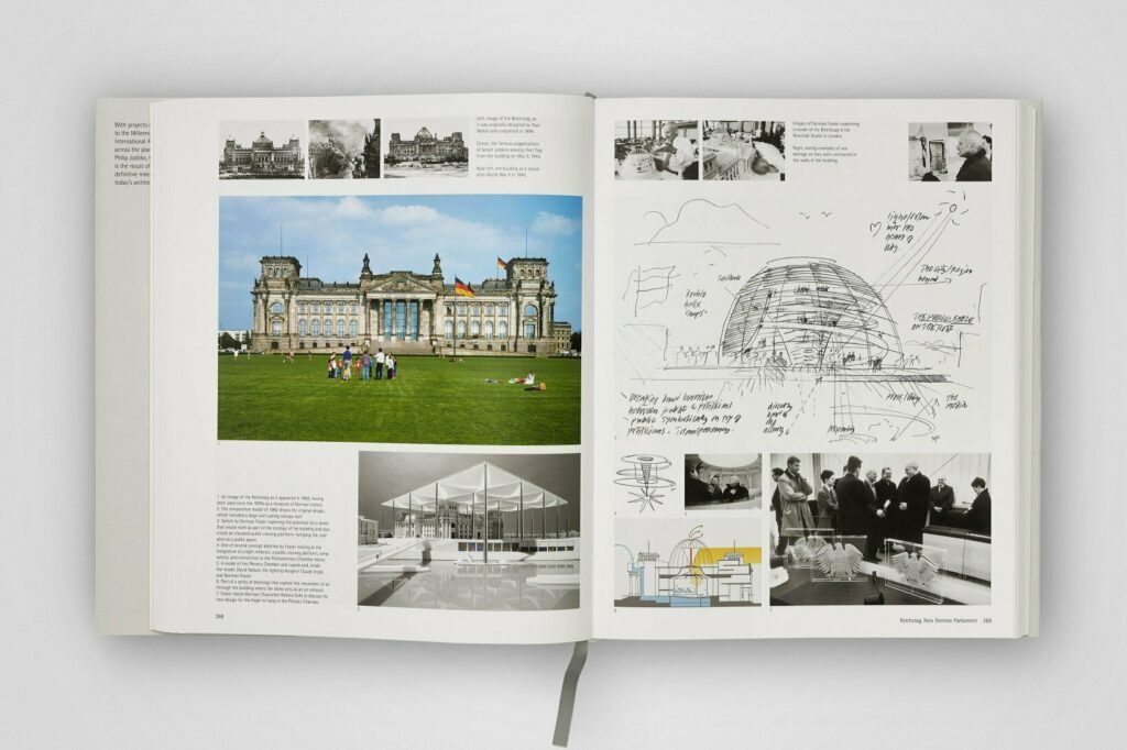
Foster reinterpreted the central principles of early industrial modernism – that of assembly line production and the systematic use of modular parts that can be joined on site to form larger and thus sometimes unusually filigree structures – for solving structural tasks and made them useful for himself like no other. As we know, he learned from one of his heroes, Richard Buckminster Fuller, who is still famous today for his “domes” – lightweight dome buildings, conceived without the banal demands of everyday suitability. But he openly admits here that even Foster’s glass and accessible dome for the Reichstag in Berlin was inspired by the Bucky-Fuller “domes”. Although this connection is actually so obvious, I first had to be made aware of it. Equally striking is the number of preliminary studies and variants that Foster and his team made to arrive at the current form. This one has the citizens strolling symbolically and with full intention high above the politicians in parliament. The typographically trained eye immediately sees who Foster’s second great hero is: both volumes are in “Rotis”. The typeface is named after a small hamlet deep in the Allgäu region of Germany, where it was designed in the late 1980s by its landlord Otl Aicher. Foster made several pilgrimages there and was able to win the admired graphic artist and corporate designer for several joint projects, including the Bilbao underground.

The comprehensive exhibition was produced in collaboration with the architecture expert and Harvard graduate Philip Jodidio, the Norman Foster Foundation in Madrid and Foster + Partners. Richly illustrated with over 2000 photos and sketches from Foster’s archives, the first volume shows the most important buildings and their preliminary studies, while Foster explains the sources of his inspiration in eight illustrated essays in the second volume. Charming Tintin adaptations can also occur; one learns that a Foster building can be seen in the Kubrick classic “A Clockwork Orange”, travels around the world with the busy Briton while leafing through the pages and, the longer one reads, likes to follow him all the way to Mars. For he has also developed structural concepts for buildings on distant planets that could largely be realised with materials available on site. Here the almost 90-year-old returns to his youth, when illustrations in science fiction books inspired him. Without that visionary side of Foster’s personality, many buildings would probably have turned out far more well-behaved. In Foster’s work, the speculative and the spectacular are sometimes interdependent. Or, to use his own words: “An architect designs for the present, learns from the past and shapes a largely unknown future.

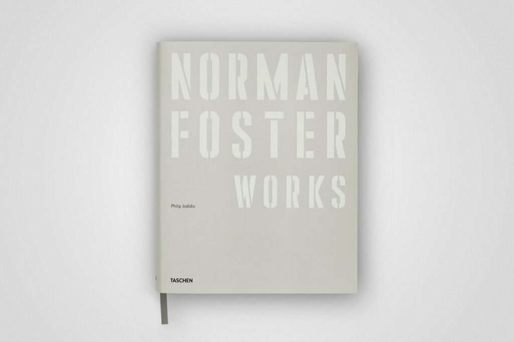
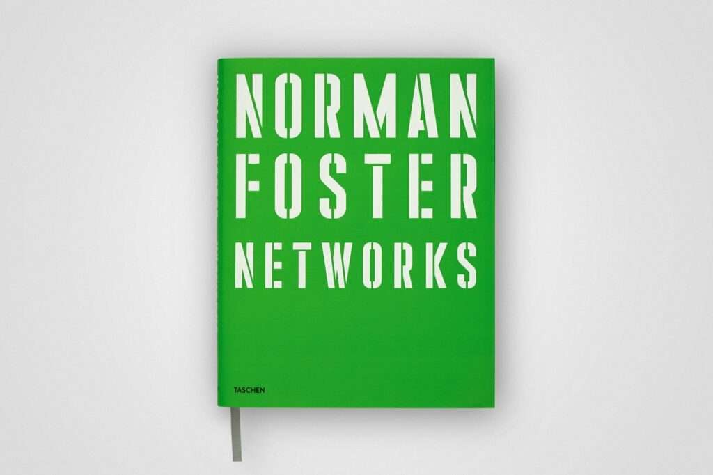
NORMAN FOSTER (2 VOLS.) WORKS + NETWORKS
Norman Foster, Philip Jodidio
2 volumes in a slipcase
1064 pages
Taschen Verlag, Köln
German translation available as download
ISBN 978-3-8365-9626-8
350 Euro
More on ndion
More reviews.
Share this page on social media:

